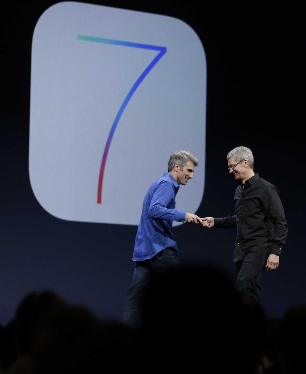
The release of Apple’s new mobile software has been long awaited by tech enthusiasts and average consumers everywhere. iOS has not undergone a major redesign in years, arguably since iOS 4, which was released in the second half of 2010.
Apple has been able to ride on the success of its previous design for so long because not many people had qualms with it, and with Android still behind in the smartphone OS race, there was a lack of motivation to change anything.
Now, Android and other mobile OS platforms are hot on Apple’s heels. The tech giant had few other options than to give in and finally redesign the software’s look and feel, which is what eventually gave life to iOS 7.
Upon first, second or even third glance, the new software seems flawlessly clean and simple — a far cry from the skeuomorphism that Apple’s Senior V.P. of Industrial Design Jony Ive has clung to for the past 6 years.
The new icons are flat, ditching the polished chrome borders and 3D shading that made the old icons look almost like physical buttons. The green felt, faux wood and leather are all gone, too. The flattening of the entire UI definitely gives the software a much more modern feel and will resonate with a lot of people.
Looking closer, though, the design is full of inconsistencies that will only become more and more obvious over time, even to the average iPhone owner.
Multiple apps that feature similar coloring, like the App Store, Mail and Weather, all feature gradients. Weather and Mail have gradients fading from dark to light, but the App Store has a gradient that fades from light to dark.
Diving deeper, there are inconsistencies between navigation in apps like Safari, Music and Photos. In Safari, the navigation buttons are wireframe and have no text beneath them. Both Music and Photos have text, but Music has shaded in icons, where Photos does not.
A lack of consistency throughout the software’s design is unlike Apple, and begs the questions, “Did any of the designers of this software work together? Or did they all send in what they had to Ive the day before WWDC?”
Of course, the final version of iOS 7 has not been released to the general public, so bugs will be worked out, and some inconsistencies might get fixed, but the fact that they showed up in the first place proves that Apple is getting a little antsy watching Google and Microsoft gain steam with their operating systems.
Both Android and Windows Phone feature flat, modern designs, and both companies have seen a significant rise in smartphone OS distribution. The difference, which will likely be shown over the coming months as iOS 7 rolls out publicly, is that Android and Windows Phone are much more consistent in design.
Will this new software spell Apple’s mobile demise? Not even close. Will Android suddenly leap over Apple and become the most favored OS of all time? Not yet. But this will definitely close the gap a considerable amount, rather than expanding it, as Apple surely hoped for.
Connor Tarter is a 21-year-old Communication Studies senior from Dallas, Texas.


