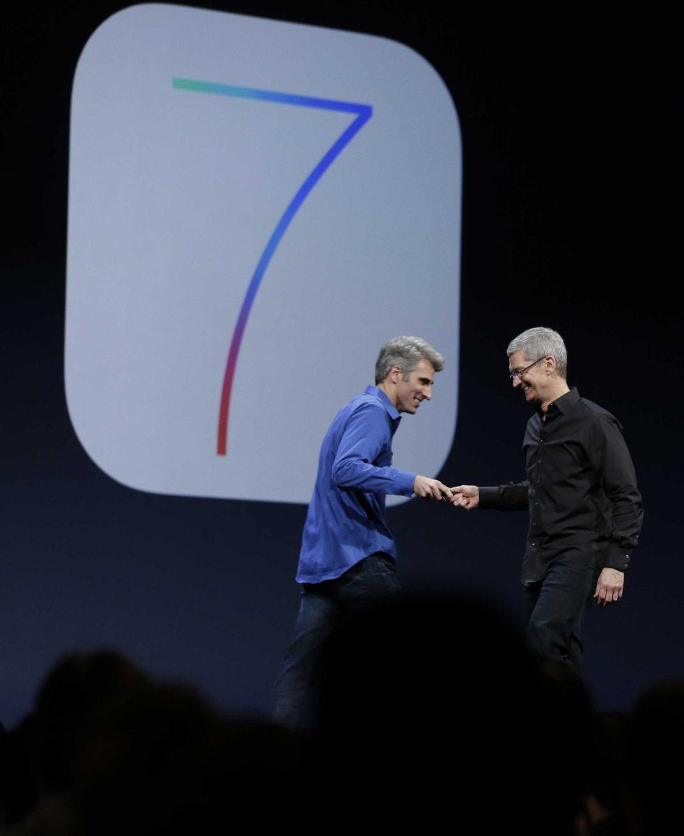
In its annual World Wide Developer’s Conference keynote on Monday, Apple showed off its most radical change to iOS since the operating system was released in 2007. Gone are the bubbled look of apps, fake-velvet table in Game Center and the overall uneven look of iPhones and iPads.
Instead, iOS 7 opts for a “flatter” design with a new palette of vibrant colors. Icons and applications no longer resemble real-world objects — and they were never supposed to.
With those changes, Apple has successfully injected new life into an operating system that, compared to its competitors, was beginning to look grossly outdated.
Android, Windows Phone and, to some extent, BlackBerry all sport modern, clean designs that emphasize simplicity over all else. And until the reveal of iOS 7, Apple lagged far behind in that aspect.
But now, its beautiful
For starters, there’s a new lock screen. Instead of swiping from left to right, users swipe up from the bottom of the screen.
The home screen contains the same rows of apps as any iOS device, but tweaked. App icons are brighter and more childlike than before and, at least for Apple’s native apps, have the same theme across icons.
But the changes aren’t completely aesthetic. iOS 7 adds AirDrop, a feature familiar to Mac OS X users, to iPhone and iPad. By activating the feature, users are able to send files, photos or websites to nearby friends without any kind of cord or wireless syncing.
Much easier to do than tapping everyone’s phone together.
Apple’s also revamped Notification Center, changing it from the ugly metallic patchwork design of older versions of iOS to a translucent plane that appears to glide over the top of whatever happens to be on your screen.
That’s one of the best things about iOS 7 — transparency. Swiping from the bottom up to access Command Center, for example, brings up a blurred window in which all of the phone’s settings, be it brightness or bluetooth, are easily accessible. But whatever was on the screen before accessing Command Center is still viewable and therefore still present in the users’ mind.
iOS 7 isn’t an incredibly radical departure from iOS 6. The app drawer home screen is the same, and the same basic functions that make iOS what it is are still there, relatively unchanged.
But the aesthetic overhaul presented in the latest version of Apple’s mobile operating system proves that revolutions don’t need to happen every year, and looks is incredibly important in the mobile world. The simple act of flattening icons, simplifying colors and adding translucency, makes each individual application and the framework that surrounds it much more connected, ultimately upgrading the user experience.
iOS 7 is a long-awaited update to one of the best operating systems out there. Don’t be put off by its differences — embrace them. That’s what puts Apple above the rest.
Taylor Balkom is a 21-year-old mass communication senior from Baton Rouge.


