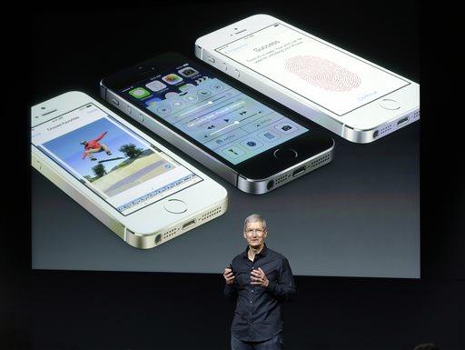
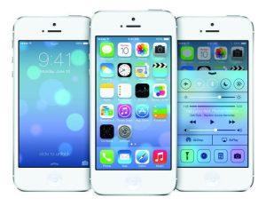
Apple released the latest version of its mobile operating system — iOS 7 — on Wednesday to millions of i-Device owners worldwide.
While the update is a welcome change from the sometimes stale nature of iOS 6, not all changes are necessarily good.
Here’s my brief review of Apple’s “most significant update since the original iPhone.”
The Good:
1. Layers, Layers, Layers
One of the biggest problems with iOS versions of old was the lack of a uniform feel across the system. Apps always opened from the center of the screen and felt disjointed from each other. There was no single, fluid motion that navigated around your phone. It was like looking at a mountain through a bug’s eye — several windows, none of which held the complete picture.
iOS 7 doesn’t fix that completely, but it makes a strong effort to bring uniformity in motion across the iPhone.
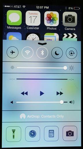
And a big part of that is the introduction of layers into almost everything.
Let’s start with the lock screen — the time and date appear to float a few centimeters above the background. Swipe to the right and the “layer” that time and date are on simply glide away, as if on glass.
Same thing with the redesigned Messaging app. The keyboard is transparent, so when you’re scrolling through messages, the colors appear to bleed through the text box.
It’s more than a visual gimmick. Layers make everything in your iPhone feel connected; like every app, text and web page is only a glide away.
2. Multitasking
I’ve written extensively about the demise of Palm and webOS in the past, but one aspect of that failed operating system has impacted those that survived — card-based multitasking.
A double press of the home button no longer brings up an uninformative row of icons representing open applications. Instead, the apps are suspended in a preview window that can automatically refresh when in a different app.
Closing an application is as simple as flicking a card away to the top of the screen.
Now, there’s definitely a larger hit on battery life — especially if you turn automatic refresh on — but it’s leagues ahead of where multitasking was on iOS 6.
3. Camera
As a photographer, my phone’s camera is one of, if not the, most used feature. But half of the usability of that camera comes from the built-in app. It’s largely remained the same since the first iPhone — usable, but nothing special.
The iOS 7 camera app is awesome.
It’s simple, elegant, and incredibly functional. Remember that awkward little switch at the bottom-left corner that would alternate between still pictures and video? Gone.
Just swipe left or right to switch between the regular camera, a square crop, panorama mode and video.
Additionally, Apple’s built-in filters are to the immediate right of the shutter button and quickly accessible. The HDR option is persistent at the top of your screen.
Speaking of shutter, the lag between pressing the shutter button and snapping the photo is almost non-existent.
Apple’s also updated the way the camera chooses ISO, aperture and shutter speed, making properly exposed photos all the more common.
It’s a welcome update and, outside of Control Center, my personal favorite.
Unfortunately, not everything about iOS is great.
The Bad:
1. There’s a lack of consistency
In iOS 6 and earlier, every actionable input was a button. There was a back button in the Messaging app and a delete key on the number pad.
Now, however, buttons are gone. “Send” in Messaging is simply that word next to the text box. “Delete” and “Emergency” on the lock screen just float near the bottom of the screen.
But, they’re surrounded by other things that have borders, like the numbers on the lock screen or the character keys in Messaging. “Call” is also in side of a huge green box in the phone app.
Why? What makes “Call” need to be in that box but have “Delete” borderless? There’s simply not a logical reasoning for those decisions, and that’s a big deal not only in design in general, but also to Apple — a company almost built on the way it designs everything about its products.
The most egregious oversight by Apple is the new Mail application, but specifically how it displays new messages next to different inboxes.
Instead of anything bright or noticeable indicating you have a new message, it’s just a simple number, black in color, in the “I’m so skinny it’s I’m sometimes unreadable” Helvetica Neue font, displayed next to the inbox title. It’s the exact opposite of “jumping off the page” — something updating data like that is supposed to do.
2. Icons. Ugh.
I love flat design, which is why iOS is, overall, a welcomed update for me.
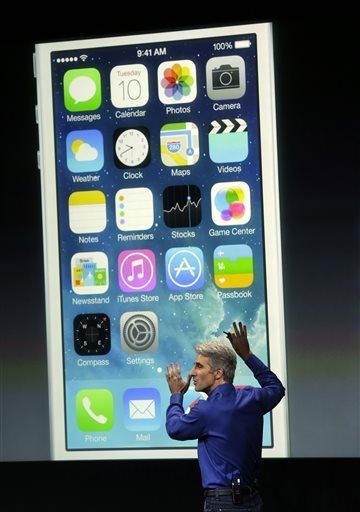
But some of Apple’s native app icons are downright hideous.
Instead of a lovely sunflower for Photos, there’s just a rainbow pinwheel. If “Photos” wasn’t attached to the bottom of the icon, I would have no idea what it was for.
It’s the same thing for Game Center. While I’m not a fan of the app or Game Center to begin with, the icon is just four color blobs all on top of one another.
Not only does that not even kind of convey a social gaming hub to a casual user, it’s almost the exact same as the Photo icon, just with blobs instead of a pinwheel.
It just doesn’t make sense. Apple prides itself on tight, uniform design. Its old motto used to be “It just works,” which leads me to my final topic.
3. iOS 7 feels unfinished
There will be issues with any major redesign. Which is why iOS 7 isn’t everything I’d hoped for.
It’s a perfectly functional OS, and anyone who’s used an iPhone in the past can figure their way around it without much trouble. The layers are great and the color palette is vibrant, but there’s just something incomplete about the OS.
Whether it’s the unexplainable icon designs for Photos and Game Center or the inconsistencies in terms of design, it feels like half the reason Apple made this drastic aesthetic change is for just that — change.
iOS 6 was stale, yes. But it worked perfectly. Everything looked and felt like it belonged where it was.
That isn’t the case with iOS 7. Words are almost randomly floating next to boxes and circles and buttons and it just leaves me wondering: who decided to place everything where it is?
iOS 7 isn’t bad, but is it really all that good? Once the novelty of a fresh coat of paint wears off, will the issues iOS has always faced — such as static icons and little customizability — come into focus again?
That remains to be seen. All I can say is, I hope Apple’s paying very close attention to customer feedback in the coming months.
iOS 7 is a worthy update to your phone, and gives much-needed change to one of today’s most popular operating systems.
That alone will be enough to keep users hooked on Apple products.
For now, at least.
—-
Check back next Thursday for the latest and greatest in tech news.
Tech with Taylor: The good and the bad of iOS 7
September 19, 2013

Craig Federighi, senior vice president of Software Engineering at Apple, speaks about the new iOS 7 release in Cupertino, Calif., Tuesday, Sept. 10, 2013. (AP Photo/Marcio Jose Sanchez)


