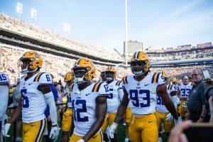
Football has become much more than just a sport. To fans, their favorite teams have become a community and those communities are represented by their uniforms. In honor of football season returning, here are each of the SEC schools football uniforms ranked from worst to best.
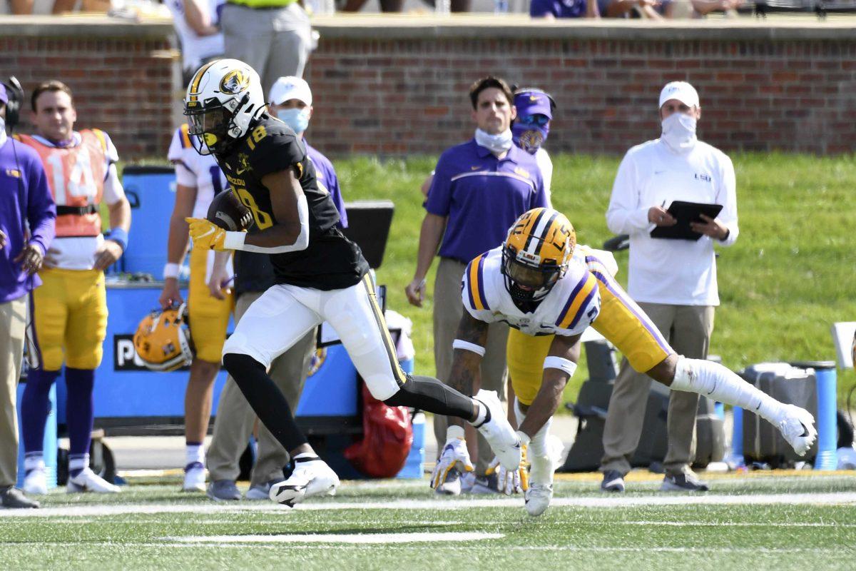
14. Missouri Tigers
Black and yellow uniforms can be a hit or miss. For the Missouri Tigers, it’s a miss.
Missouri has shown off tons of its combinations in the past few seasons, but yellow jerseys and black pants don’t sit right with me. I can’t help but think they look like a high school football team. It could be because of the font used for the numbers or the “Tigers” written on the side of the helmet. Either way, these uniforms come off as tacky.
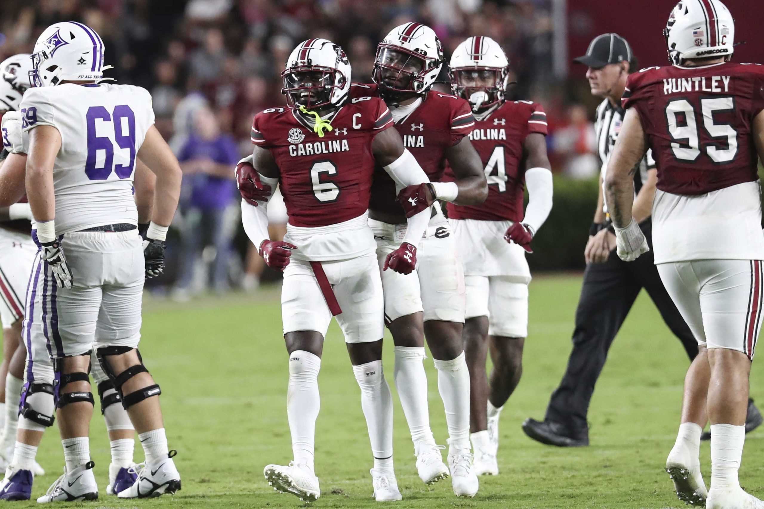
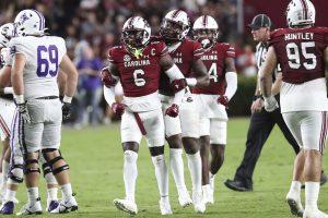
13. South Carolina Gamecocks
The amount of stripes are unnecessary.
There are stripes around the collars, down the pants, on the helmets, etc. I don’t really mind any of the color combinations, but either the all white or all black are definitely my favorites. There are just many more creative touches that could be added to this uniform than red and black stripes.
The Carolina across the chest and on the helmet are also written nicely, but the Gamecock logo on the other side of the helmet is distasteful. Then again, I am not sure how to make a Gamecock look aesthetically pleasing.
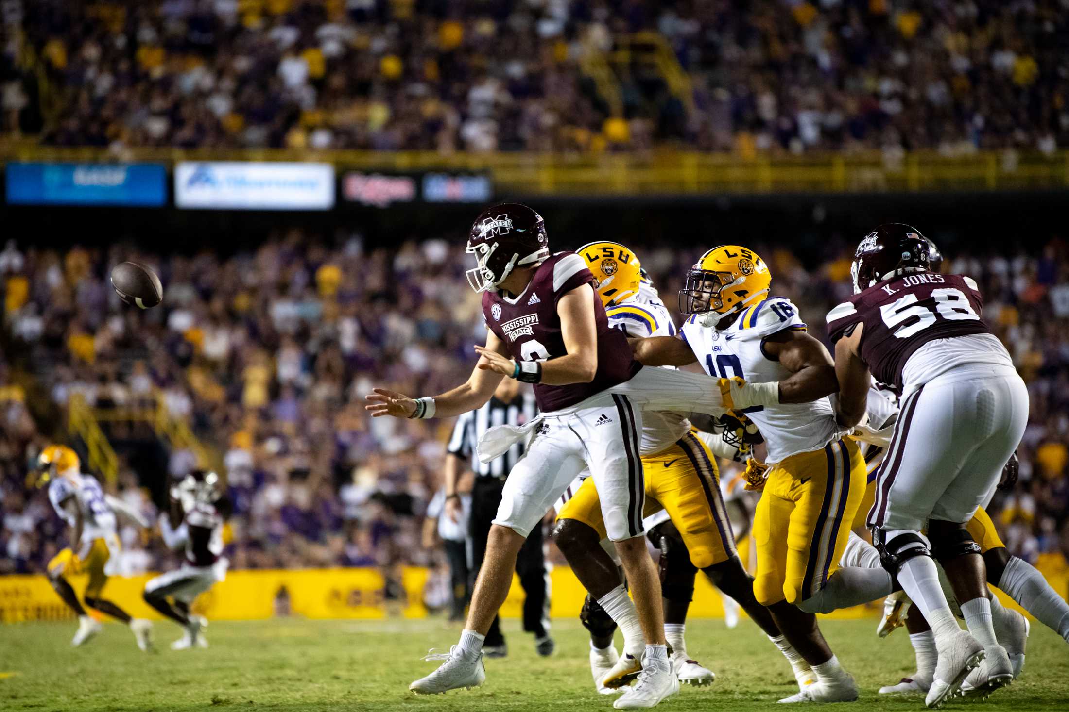
12. Mississippi State Bulldogs
It is hard to make a red and white uniform look unattractive, yet Mississippi State managed to do just that.
READ MORE: All or nothing: Three keys to victory for LSU vs. Mississippi State
Not that it is a bad uniform, it just lacks some uniqueness. This color combination saves the uniform from its dullness, since there is not much to it.
I love the M logo on the helmet; however it feels unnecessary to copy the same banner logo on the chest. I can appreciate the simplicity, but it still feels as if it is lacking something.
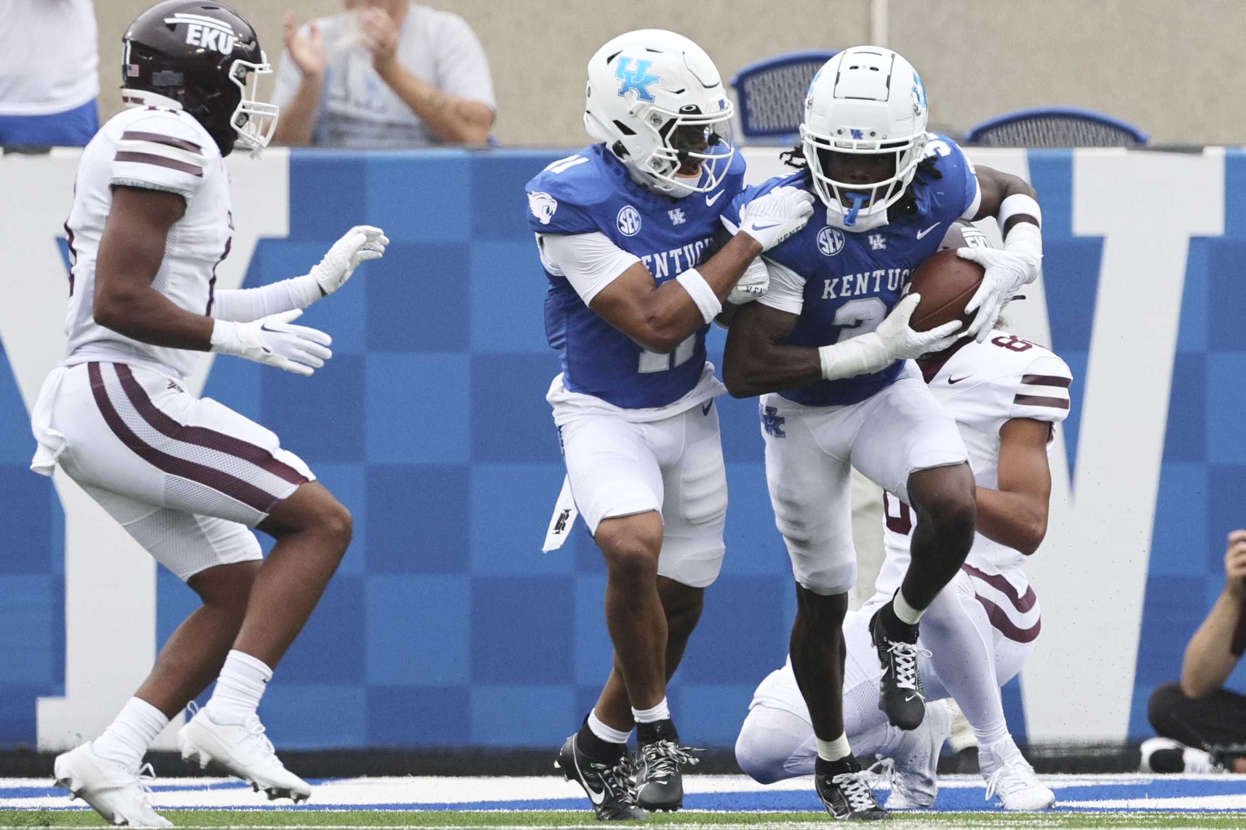
11. University of Kentucky
What’s with the checkers?
The colors of The University of Kentucky are one of the better color combinations to work with when designing a uniform because who doesn’t like blue; however, there are much cooler ways to include their checkered homage to Penny Chenery than the random placement on the sleeves.
The reflective “UK” symbol on the helmet is another reasoning for their placement of No. 11 on this list. A matte finish would have made their uniforms look much more high end, but overall, these colors create a satisfying sight.
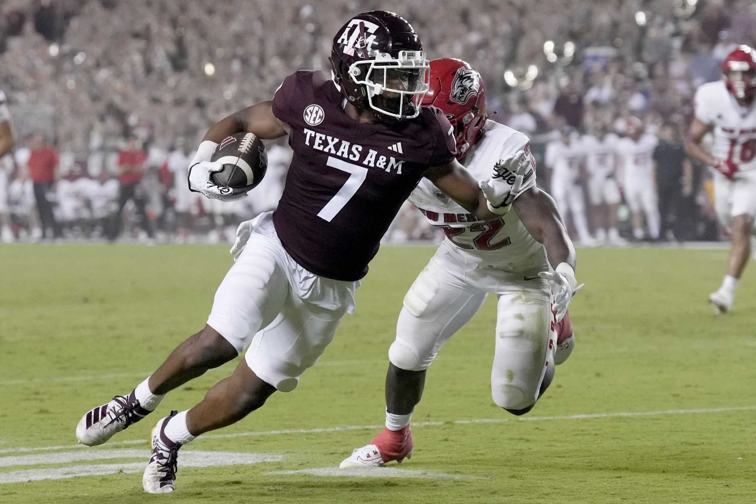
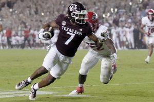
10. Texas A&M University
The Aggies’ uniforms look much better than their 2022 season did.
This uniform is the better looking version of Mississippi State’s. The helmet is what makes this uniform sit at No. 10. The way the ATM logo sits on the helmet is perfect and the T being larger is a classic move for Texas A&M University. I also admire how the team incorporates the shape of Texas into the A&M logo.
The only downside to the maroon uniforms are how the double white stripes down the sleeve and undershirt don’t continue to be doubled on the pants.
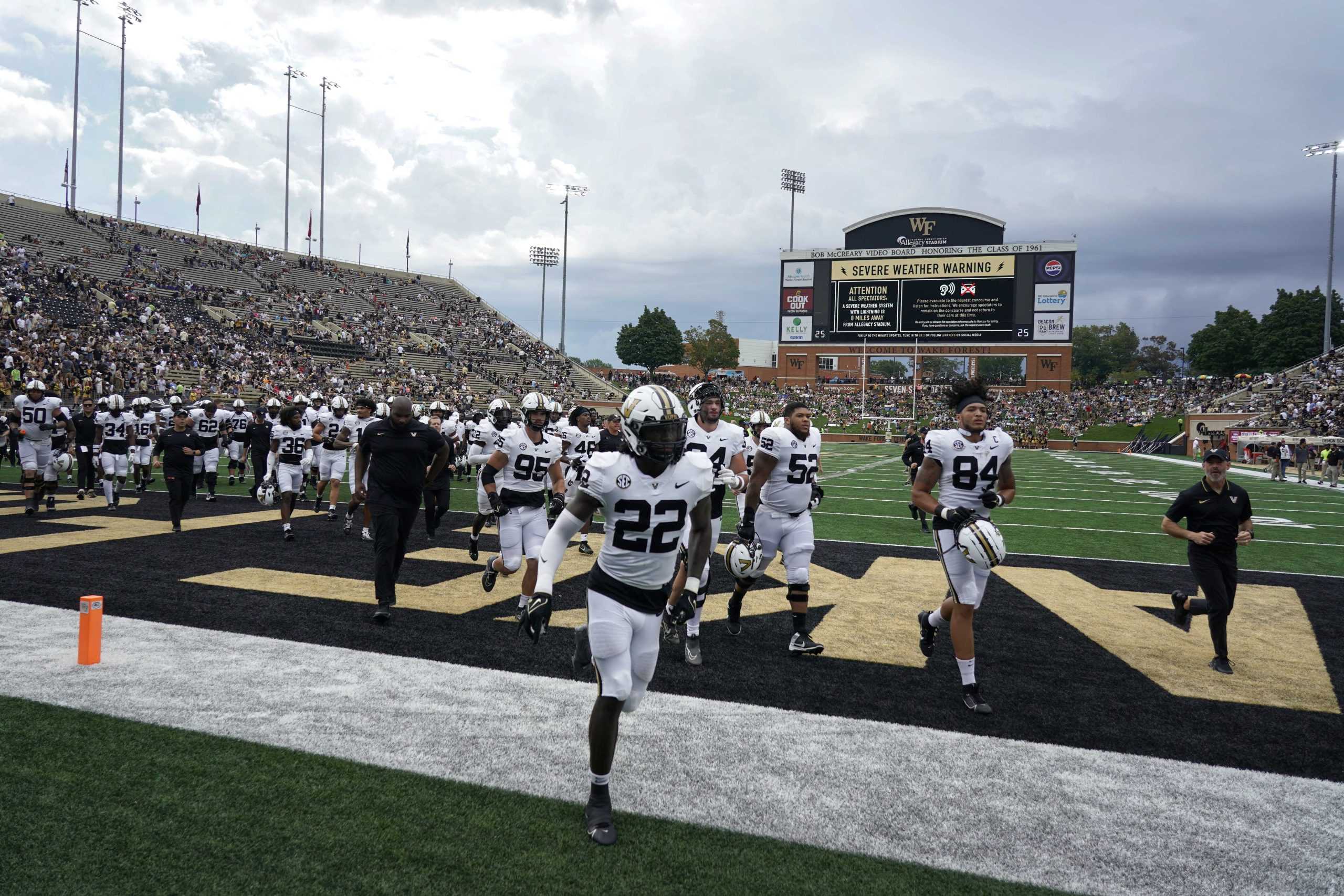
9. Vanderbilt University
If it wasn’t for Vanderbilt’s facelift this season, it would be much further back on this list.
The new “V” logo on the side of the gold helmets are much nicer to look at than the previous star logo. The black and white stripe on the top of the helmet is also a step up from the silver chain over the silver helmet. It’s safe to say the uniforms have come a long way.
Each minor detail added on the black and gold uniforms make the Commodores look more put together and like a professional team than ever before.
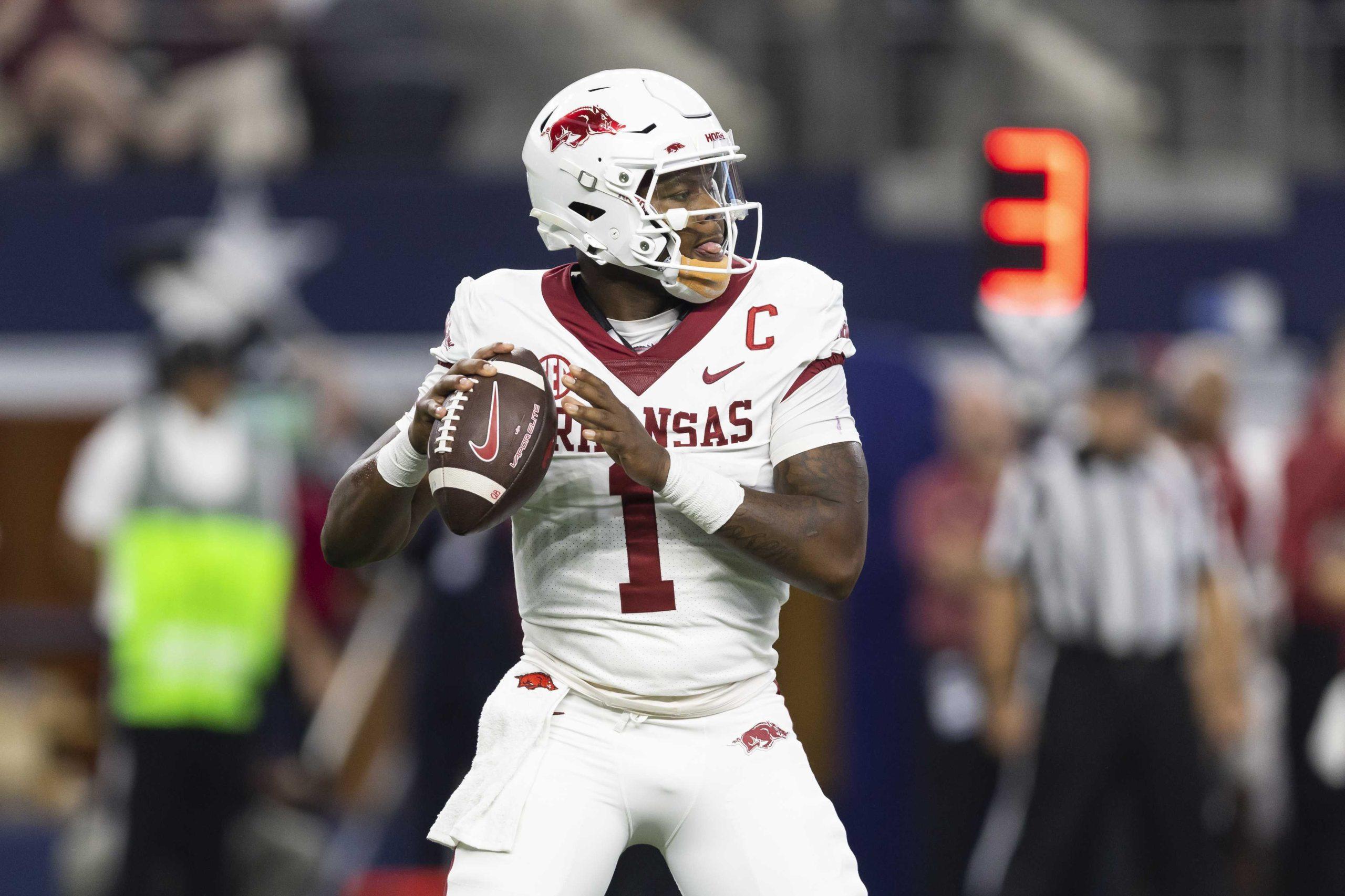
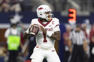
8. University of Arkansas
The Razorbacks made the right decision of switching to Nike in 2002.
Nike was able to create a classic, sleek red look for this team. The bold font used to write “Arkansas” across the front was a great choice. The letters even take up a perfect amount of space between the number and the collar; however, the hog symbol being on the helmet and sleeves feels very unnecessary.
Their newest uniform competitor will be in 2024 when the Oklahoma Sooners officially become a member of the SEC.
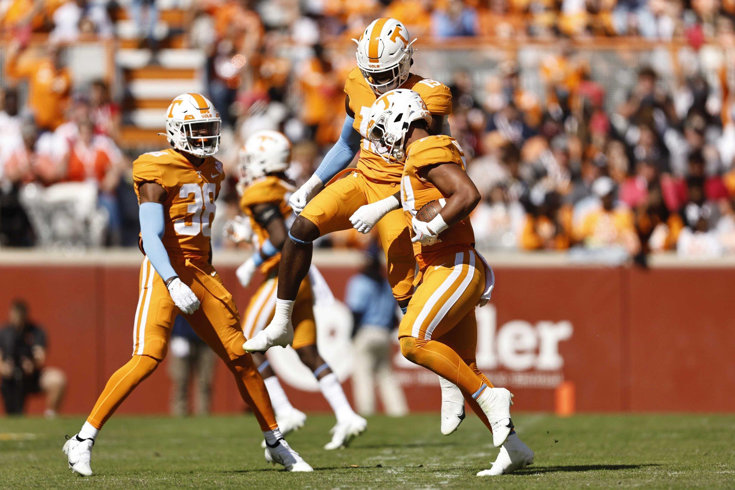
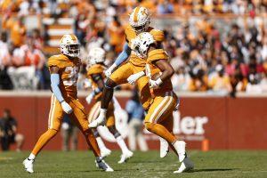
7. University of Tennessee
Tennessee definitely has the most unique color to work with in the SEC.
It is understandable that Sandra Bullock’s character in The Blind Side did not want to wear this “gaudy orange.” Despite having an interesting shade of orange, the Volunteers somehow manage to make it work. Tennessee also receives bonus points for the checkerboard print being done in an entertaining way, unlike Kentucky.
READ MORE: Editorial Board: Brian Kelly says the quiet part out loud on LSU’s priorities
This distinctive color of orange will no longer be the only one in the SEC in 2024. Once the Texas Longhorns officially join in 2024, will the Volunteers lose their exceptional color?
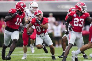
6. University of Georgia
Georgia took an excellent color combination and made it their own.
When you see black and red walk onto the field, you should be intimidated. Georgia took a different approach to their color spectrum by adding a light gray. The only change I would make is the outline around their numbers on the jersey. It makes them look like cartoon characters running around on the field.
I respect them trying to take their uniforms to the next level.
5. Auburn University
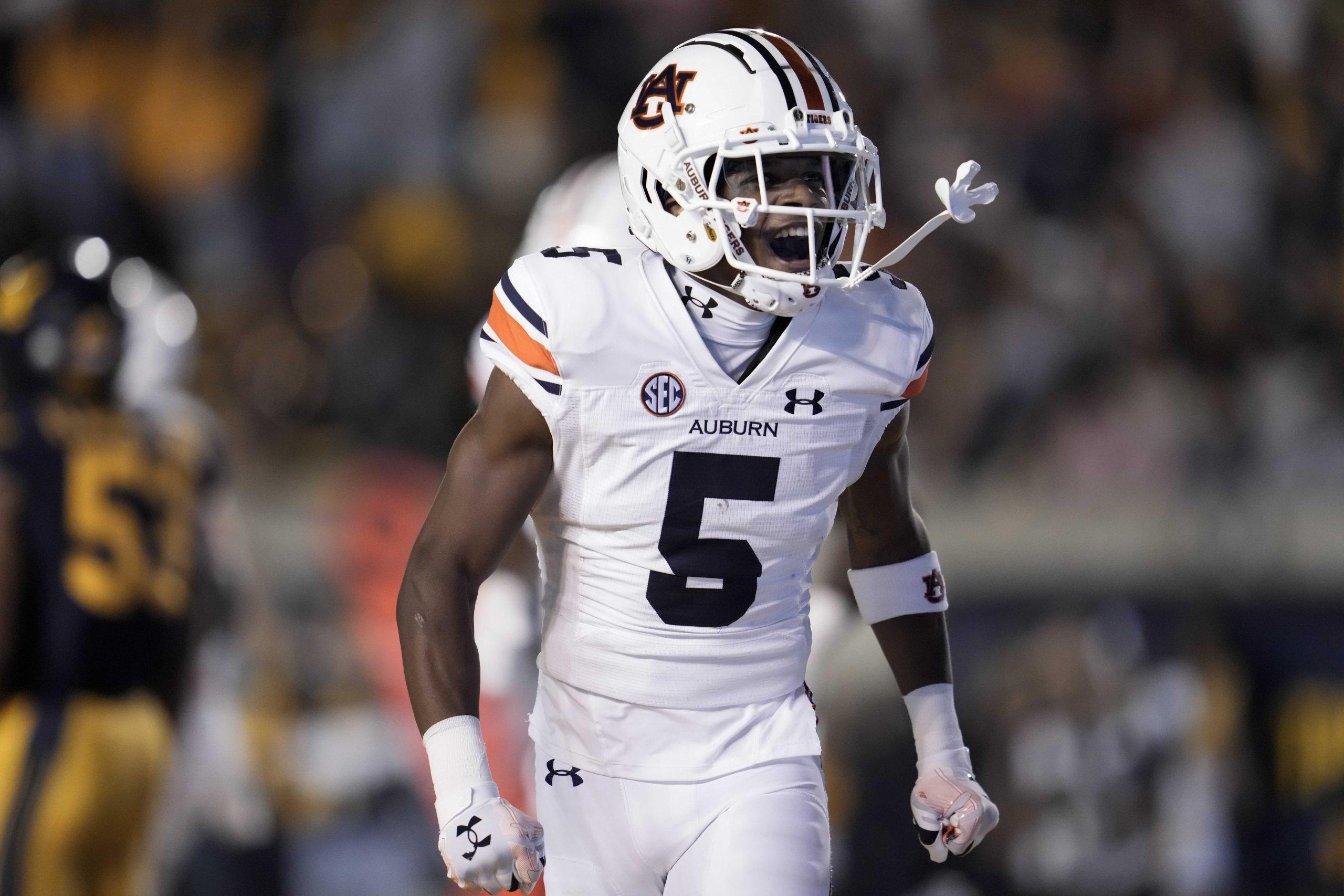
Auburn doesn’t have to do much to create an awesome uniform when your main colors are navy blue and burnt orange.
Now these stripes are done well. This uniform isn’t too over the top and the colors are strategically placed to create a satisfying stripe across the helmet and down the pants. The hints of white on the uniform makes it look modern; however my only critique would be the white helmets. A navy or orange helmet would make the uniform look more cohesive.
4. University of Florida
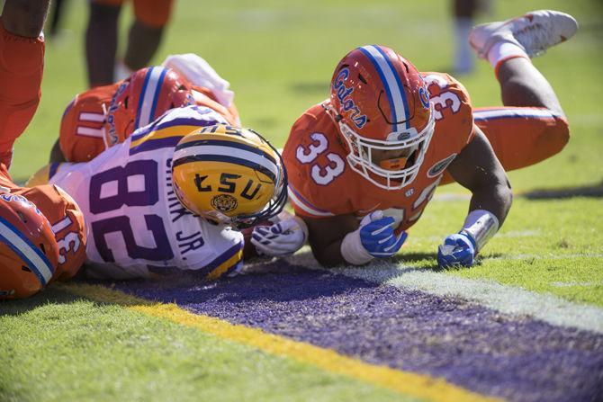
You either love it or you hate it.
Personally, I love it. The bright shades of orange and blue make the team look fun and exciting. Normally I am not a fan of the script on the sides of the helmets, but the Gators manage to pull it off. As long as the Gators are wearing their orange helmets, their uniforms look great.
Florida has one of those uniforms where you look at it and feel excited for football season.
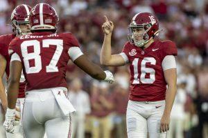
3. University of Alabama
It’s safe to say Alabama has the cleanest red and white combination in the SEC.
According to the school’s website, the official colors of The University of Alabama are crimson and white. This particular shade of red is much more pleasing to look at than other shades of red in the SEC. The uniforms look simple at first glance, but really there is more to it.
The helmets are a representation of Alabama’s coaching history. Since the passing of Bear Bryant, former head coach, his legacy has continued through the players’ numbers on the helmets, a tradition of Bryant. From the “Bama” across the front of the helmet to the “Crimson Tide” in the back, the detail is what makes the uniforms stand at No. 3. It’s just a classic look.
2. University of Mississippi
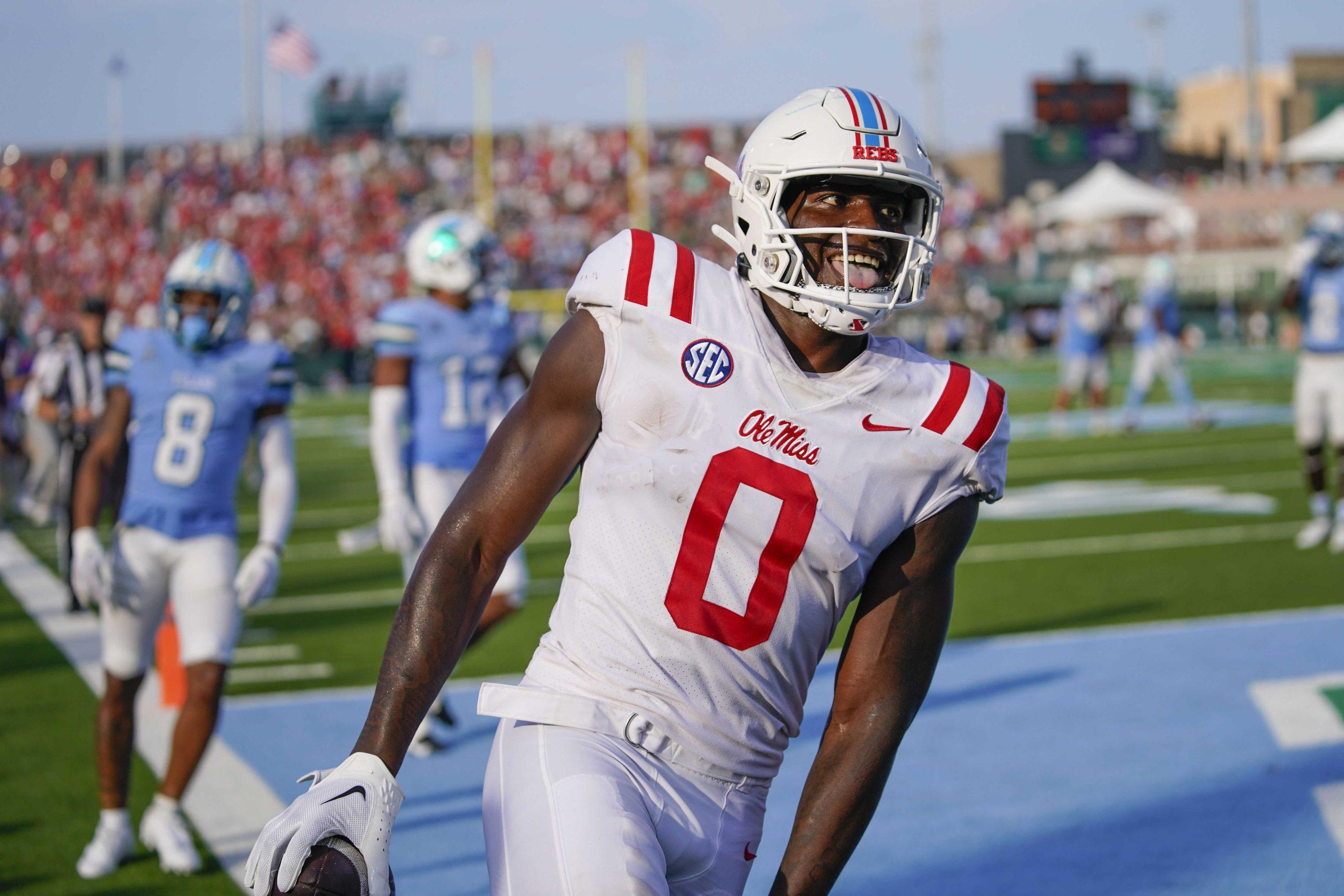
When your official school color is this shade of blue, it is almost impossible to create an ugly uniform.
Ole Miss has come a long way with their uniforms. They are capable of making fans recognize the two different shades and associating it with Ole Miss. They sit at No. 2 because no one hates powder blue.
My only critique would be the two white stripes on the shoulders. The stripes should end sooner, and it would look ten times better with another color in the middle of them.
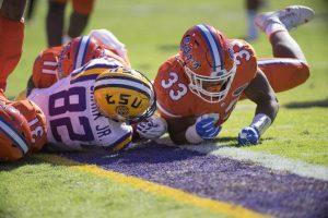
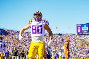
1. Louisiana State University
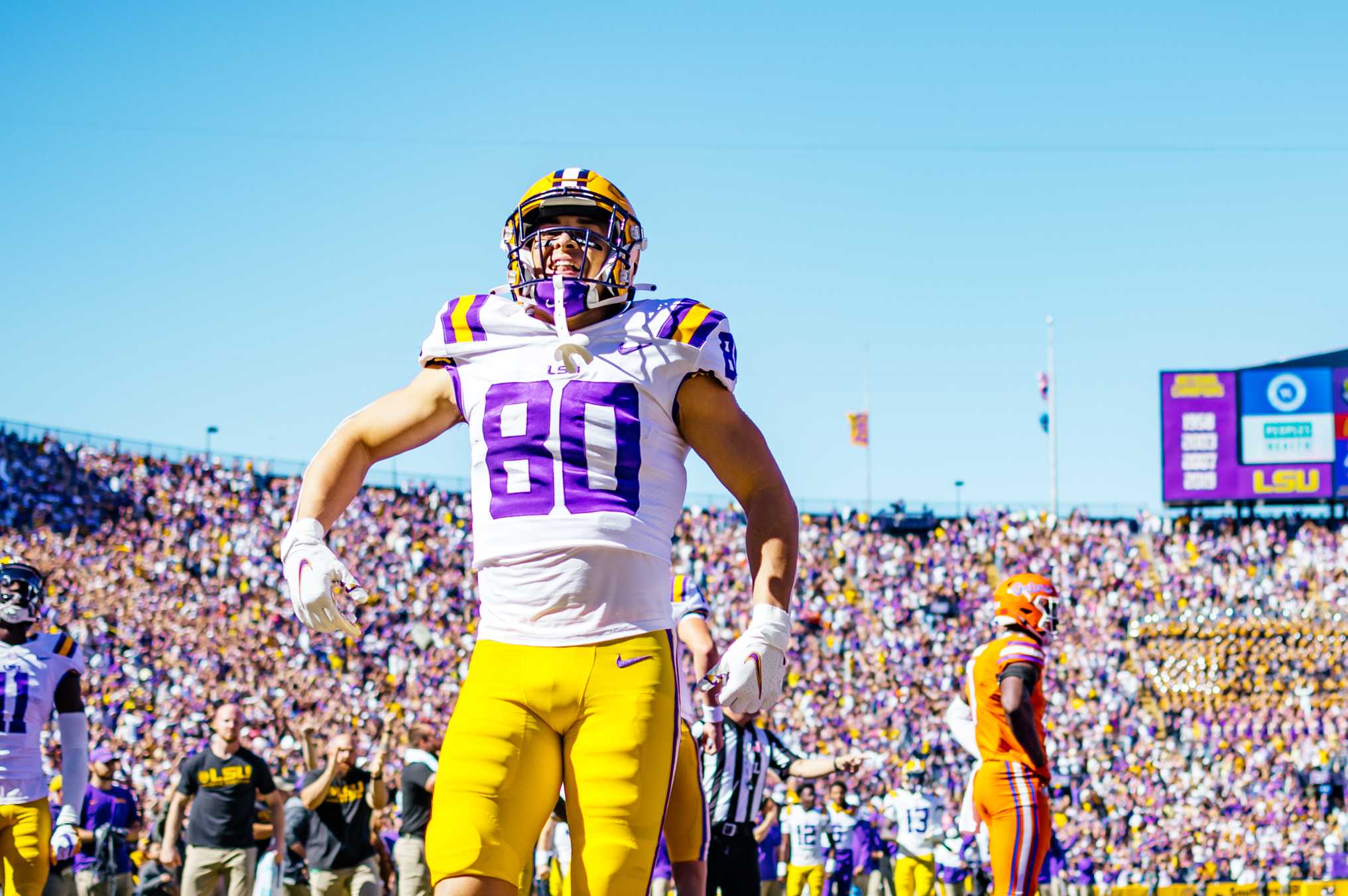
Even if you hate the Tigers, you don’t hate their uniform.
Like many other teams, there is history behind the uniforms. The purple and gold represents the state’s most popular holiday, Mardi Gras. Although Tennessee has the single most unique color, LSU has the most unique color combination. There are many ways LSU could have destroyed the uniform with overbearing colors, but they never have.
Using white as the main color was a safe choice, but the hints on purple and gold is what ties this uniform together.


